
Upsun.com: Home page post GA launch
Upsun creative team
Name development
Allison Simmons
Savannah Bergeron
Creative direction
Savannah Bergeron
Animation
Kirbie Koonse
Mario Jacome
Content
dj davisson
Creative support
Heather Argus
Emily Li
Development
Alejandro Garcia-Abaroa
Abby Milberg
Illustration
Kirbie Koonse
Savannah Bergeron
Web design
Joanie Gauthier
The Upsun Brand
We tackled the Upsun brand like we tackle everything else: with open doors and open minds. For Upsun design teams, research is always step one. We collected ideas from customers, partners, prospects, and our own teams. As part of that process, we hosted more than a dozen, cross-team brand workshops, collaborating across the board (and oceans) to help us build the strongest possible brand.
What we learned from the experience was that letting people join the process helps build trust, gives each person a sense of brand ownership, and is just plain fun. We scrapped some ideas we thought were sure bets. Came away with new ideas that we never would have in a silo (e.g., Test in prod without testing in prod. Genius, Simon!). And built confidence in decisions we were able to validate and refine with feedback from internal Upsun engineers and other colleagues.
When you work for analytical people, it’s always easier to sell a color like pink or oozey green when you have data to back it up. Research and collaboration can’t hurt a brand; they can only give it a stronger voice.
The brand-creation process
As part of our research, we created a vast competitor comparison board in Figma, along with 50 of the top disruptors of the last year. We looked at fonts, imagery, colors, and landing pages.
After that, we developed robust moodboards and started to hone in on those elements that matched our criteria without making us look like a lifestyle brand or nature conservancy. Pairing an untechnical name with a technical company meant we needed the visual brand to quickly help our audience place us in the appropriate category.
From a foundational perspective, we took our gobs of research and interviews (as well as our own takeaways after spending time with the product) and came up with lists of words that fit—and didn’t fit—Upsun. From there, we bucketed them and distilled them into three concept words that encapsulate our brand: stability, freedom, and control. Separately, they speak to features and benefits. Together, they tell the Upsun brand story.
The three concept words (or pillars) are used to categorize features and benefits in our messaging framework. Each audience-relevant product proof point was assigned to its related pillar and written in language appropriate for the identified audience. For example, developers might care more about declarative infrastructure while business leaders might care more about compliance. But both belong in the framework.
When you work on a product as complex as Upsun, any early organizational and structural work around brand and messaging is paramount to keep teams aligned and on-point.
Upsun logo mark by Lucas Fields
The Upsun brand logo
For the Upsun mark, we wanted something simple that we could use for years to come. We began with internal exploration, then collaborated with two freelancers who devote their days to brand-mark creation.
These amazing, collective efforts presented us with a difficult decision. Ultimately, we chose a simple sun mark from designer Lucas Fields. Our new logo fuses a sun, moon, reflection, and rainbow.


The Upsun colors
To start, we explored sunset and sunrise colors, which led us to wonder what a sci-fi sunrise would look like. That landed us in a neon world of vibrant colors, with soft pastels to lean on.
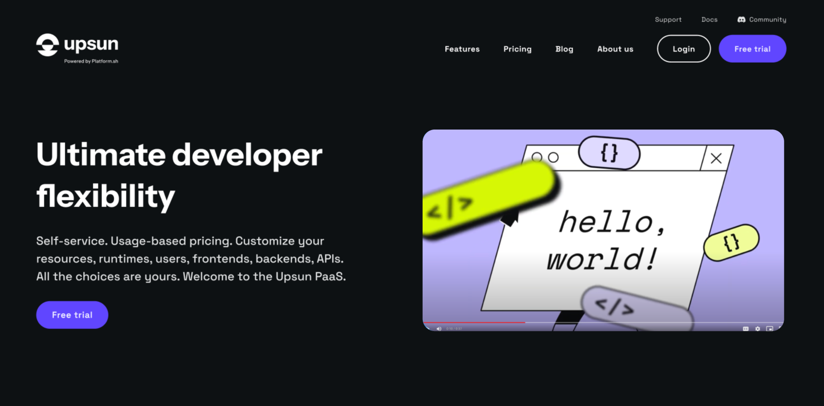
We wanted a standout color that did what pink did for Platform.sh. Our ooze or neon lime color does it. Love it or hate it, you have a feeling and will notice this color. Paired with strong, new neutrals, it’s a bold choice that feels modern, tech, and confident.
As much as we wanted to avoid blue, we needed a neutral color that could cross from product to brand. We chose a vibrant violet that is neither purple nor blue. It’s a calm color in our product console that works as a button and complements our neon ooze.

@ Kirbie Koonse

@ Kirbie Koonse
The Upsun visual style
Developers tell us they sniff marketing from a mile away, so it was important to be authentic. Having an audience that loves to scrutinize gives us a chance to hide easter eggs and get cheeky. We wanted to update our illustration style to be more flexible and modern, while elevating console-style illustrations that show off some buttery code with plenty of frameworks to see.
We chose to launch in dark mode, the preference of many developers. The future goal is browser-based modes (or location, is it night where you are?), with options for developers to choose what works best for them.
What did we learn?
We believe that brand doesn’t come from a person or a single voice. The brand’s job is to be a translator of a message or vision. We take the technical, mucky, hard-to-understand ideas and mold them into something tangible and meaningful. Brand needs to be a visual and experiential representative of the vision of our founders and engineers building the product. It needs to make a person feel the way our product makes them feel when they understand what it can do. And sometimes, it just needs to feel cool and something other people want to be a part of.
Animation @ Mario Jacome