
Loopdee: a centralized school communication hub

Branding • Product design • Naming • Product visioning • UX/UI • Design systems • User research • Web design • Illustration • Color systems • Pitch presentation • Remote collaboration
A lesson in exploration
School communications are hard—leaving educators and parents frustrated by often being in different loops of information. Today’s solutions are clunky, hard to use, and lacking smart integrations with the tools parents are already using.

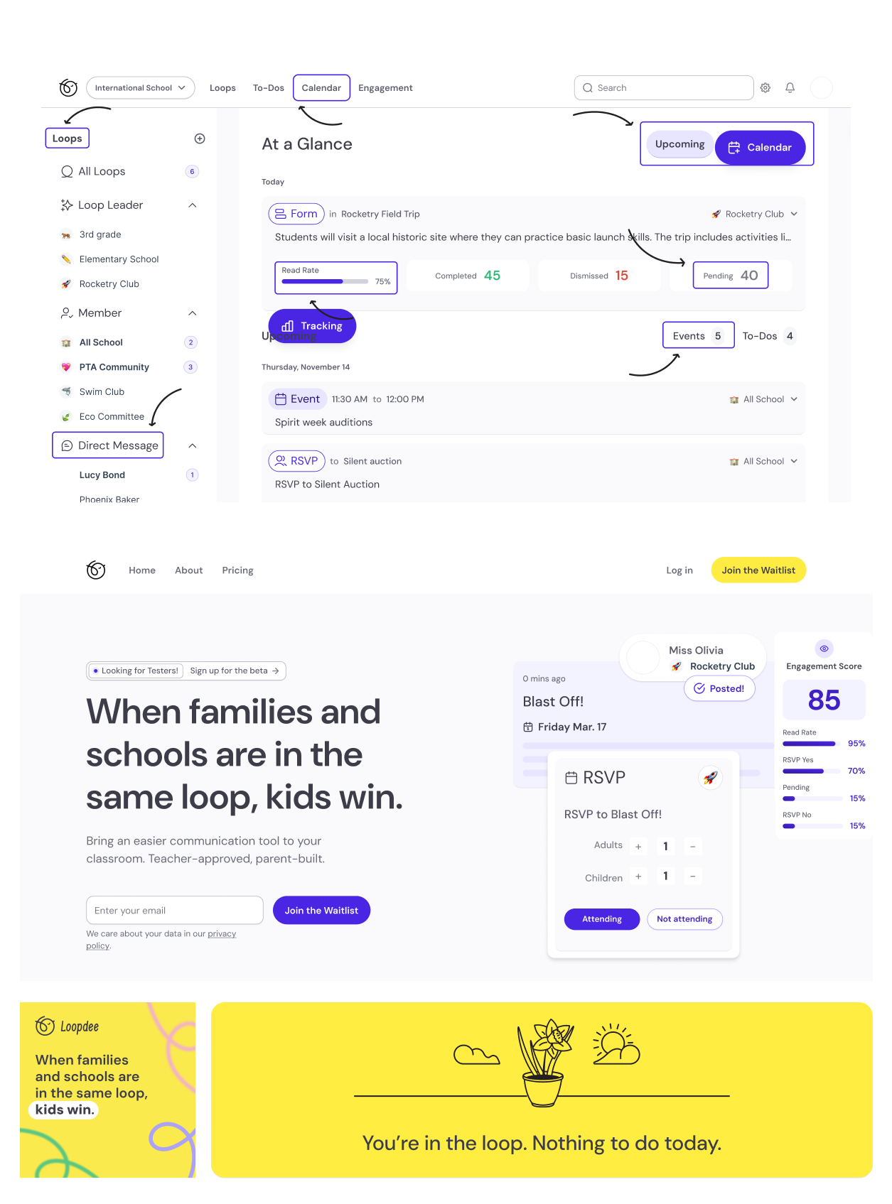
We developed Loopdee. An all-in-one platform that simplifies how busy teachers and busy parents send and receive information. AI-integrations clarify and shorten messages, calendar events are automatically added, and sign-ups and RSVPs are a breeze.
Loopdee Roles
User, Market Research, Product Architecture
Allison Simmons
Brand, Systems, UI
Savannah Bergeron


The brand
Naming
Communication loops inspired the name. Because parenthood is often a roller coaster, Loopdee evokes the ride in a fun way that also speaks to getting us all in the same loop.
Logo
For the mark we needed a solution with a strong icon. The Loopdee chickadee “Dee” evokes chatter and her body brings us back to loops. Paired with hand-type for the lettermark we are left with a joyful symbol that scales well while standing out on a busy phone screen.
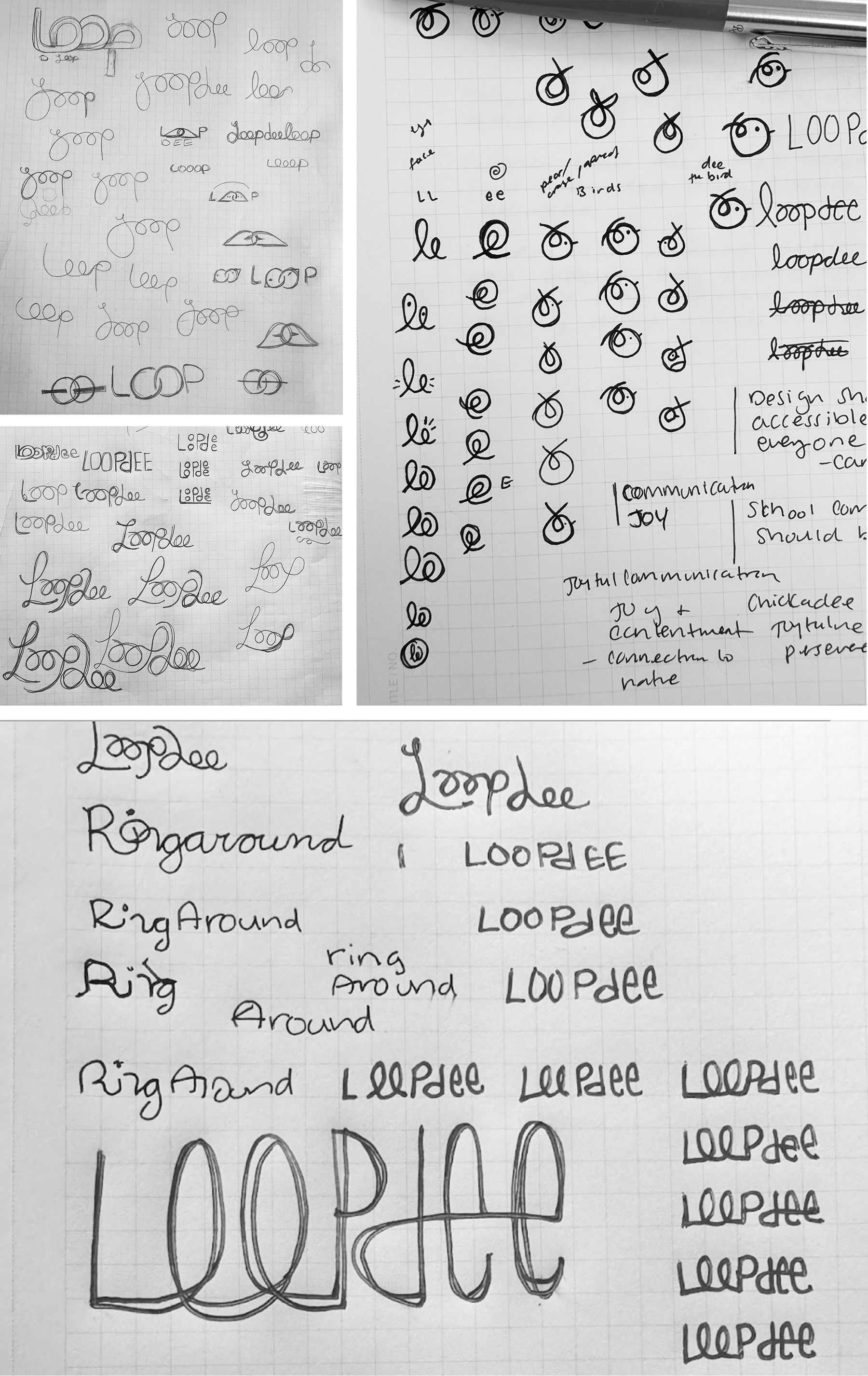
A selection of early and progressing sketches for Loopdee
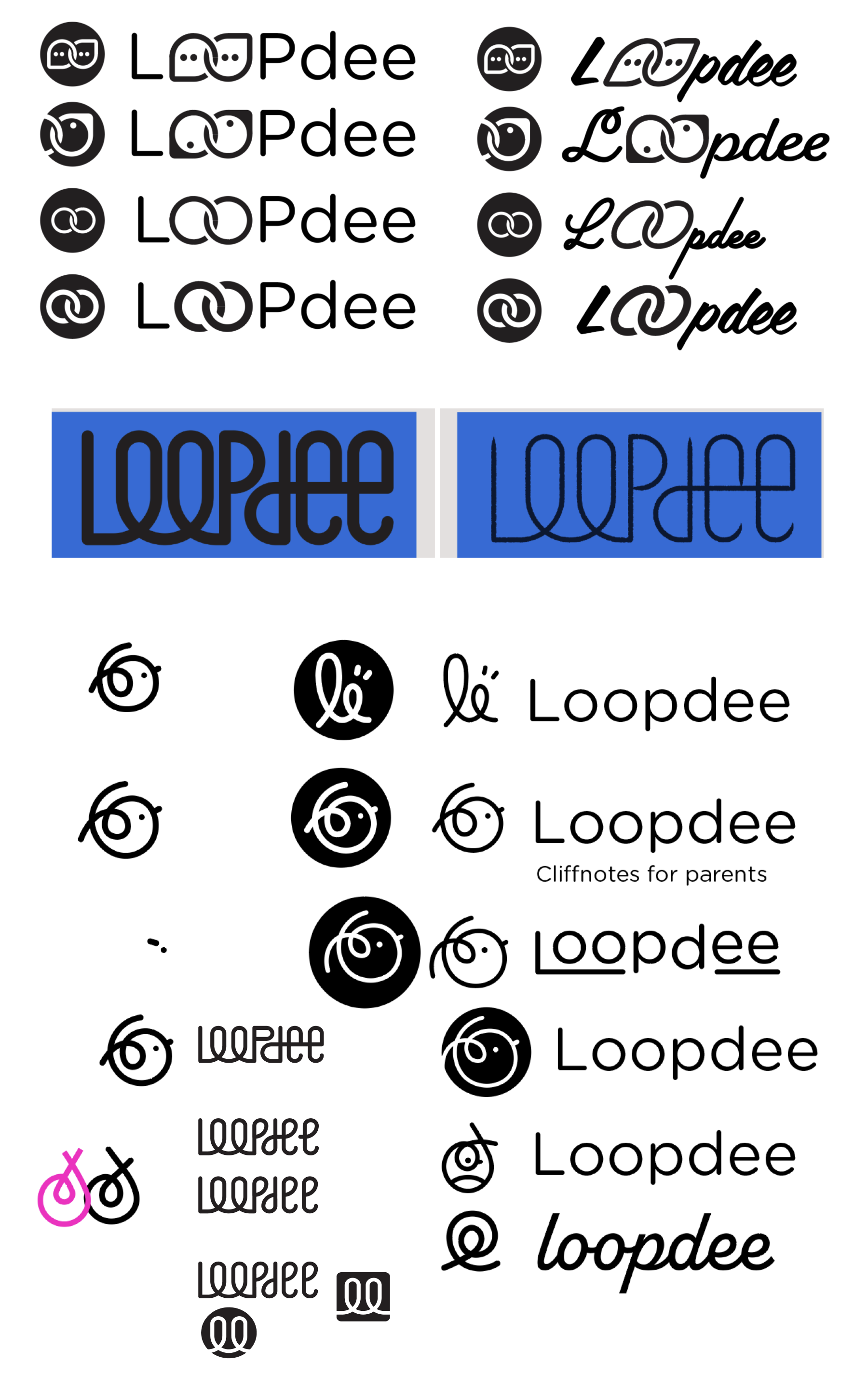
Moving into digital comps and exploration of the final mark
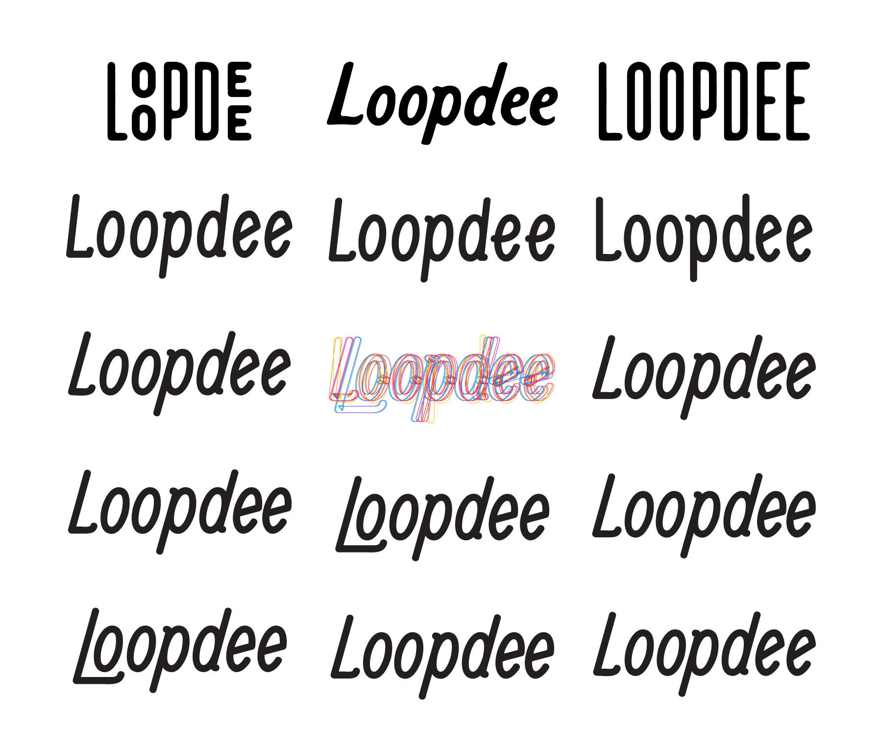
Dozens of small tweaks on the hand-type letterforms resulted in just the right angle
The final Loopdee logo
Systems
To iterate rapidly a robust system was created in Figma with 12 point color scales, branded icons, and custom components allowing exploration to quickly become final screens and prototypes.
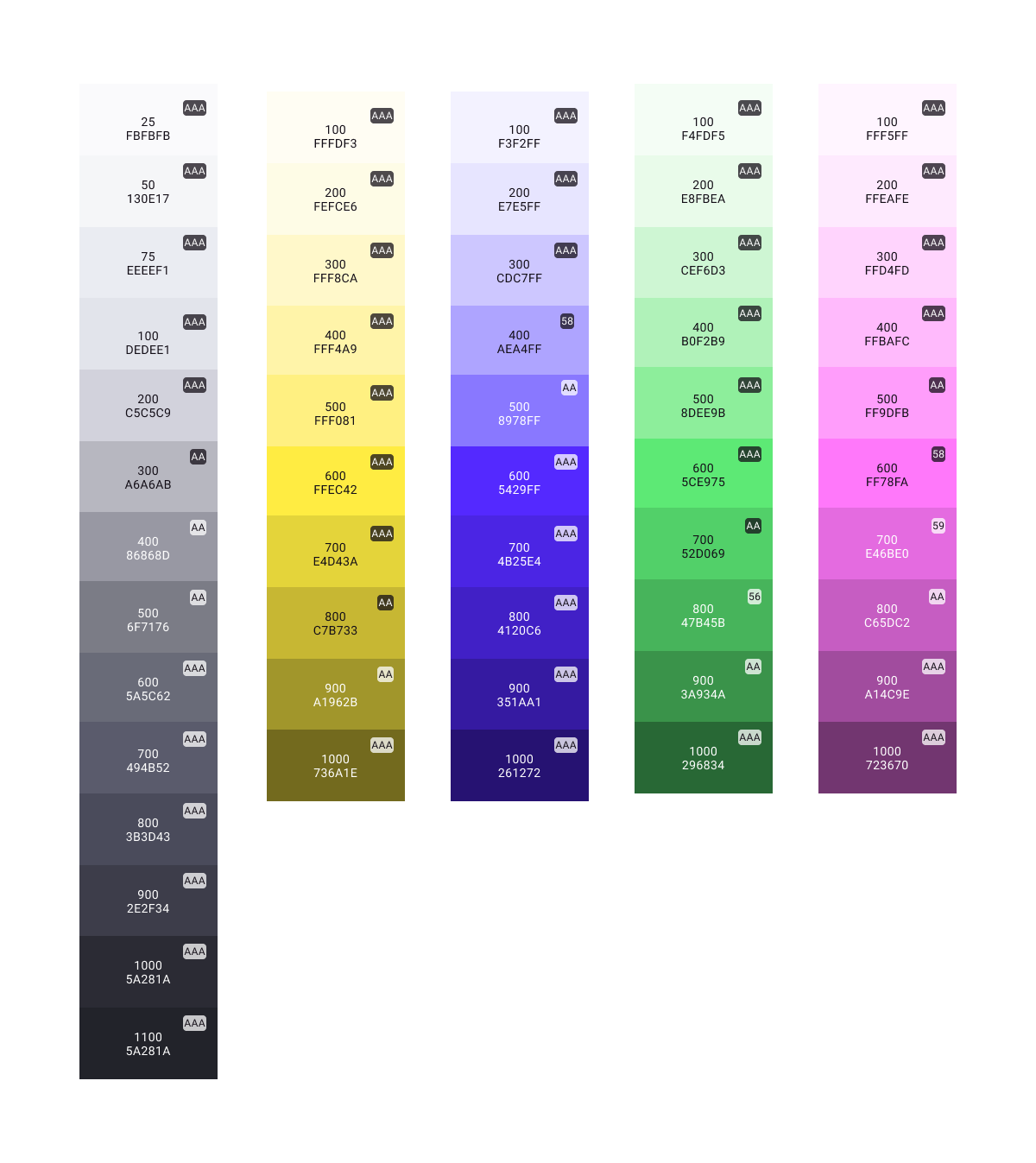
A robust pallete allowed us to meet stringent accessibility needs while also providing subtle UI shifts
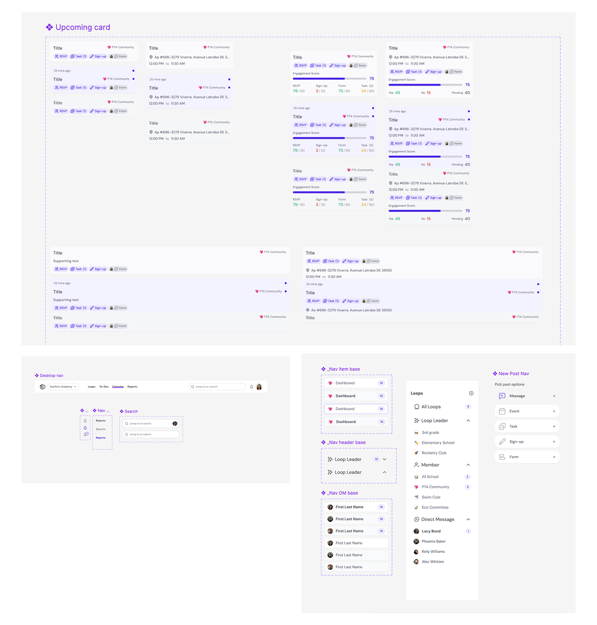
Dozens of detailed components allowed us to prototype and rabidly iterate new screens while making global edits a breeze
Approach
The Loopdee brand stands out by evoking clarity and reassurance. A quiet cog successfully delivering the information parents need in one, easy to use, place. We stuck with a classic yellow that nods to school buses and pencils, but with a strong neutral palette allowing for custom brand schemes for schools in the future.
The product
Scope
We sought feedback from dozens of educators, system administrators, and parents themselves about pain points, happy moments, and what might make their lives easier. Enthusiasm was wide for Loopdee’s feature set aimed at accessibility, clarity, and simplification in the process.
UX
Primary concerns for usability centered around an inclusive product that works without the app just as well as with. Notifications can be sent to places where parents already are like via text or email.
UI
The UI needed to be easy to navigate, clean, and work in custom branding situations. We developed a simple system allowing for branded interactions with swappable colors, fonts, and icons. Prioritizing accessibility and simplicity the Loopdee interface removes clutter and highlights top details.
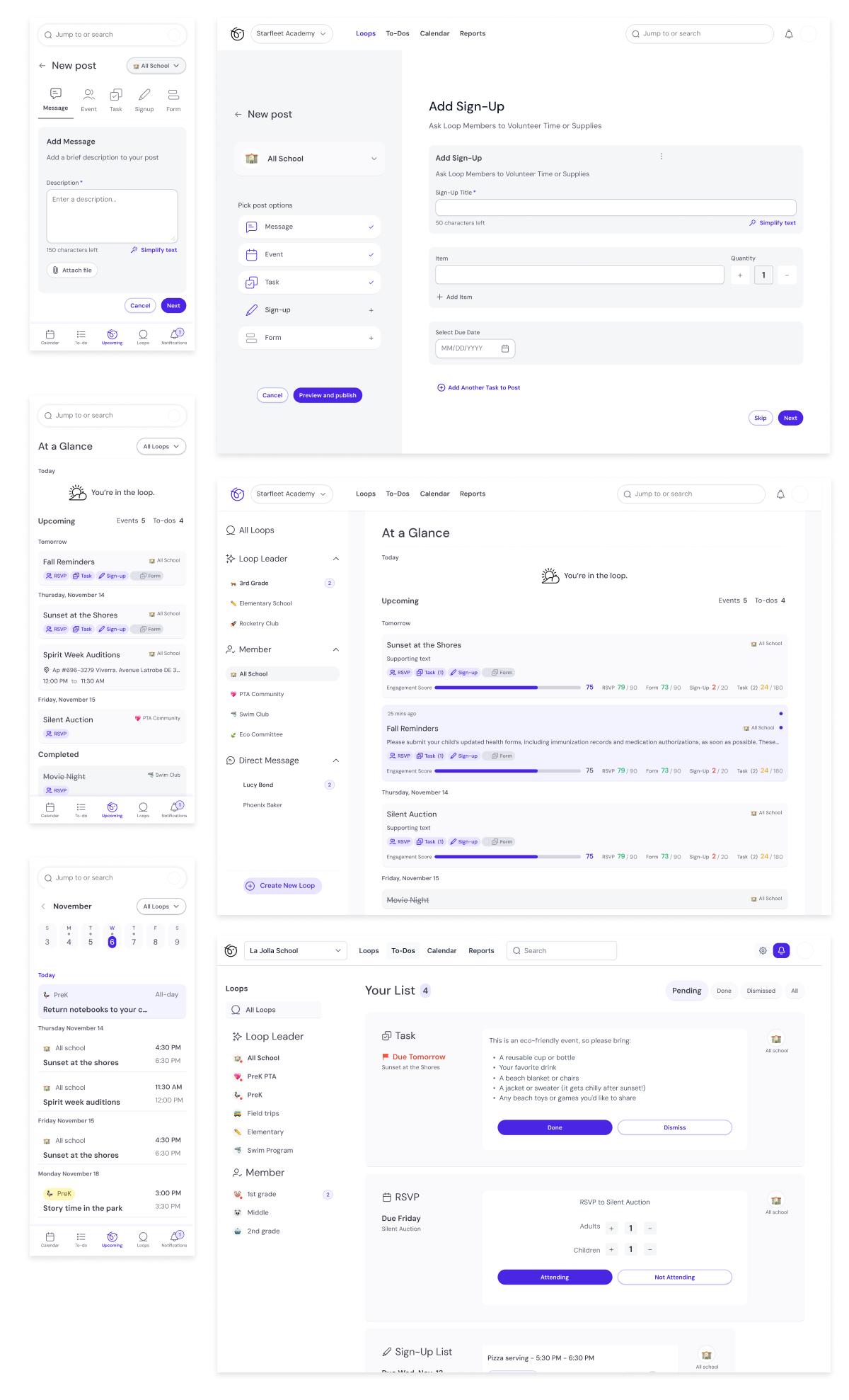
Hundreds of explorative iterations led to a clean, easy interface
Prototyping + testing
Running through 11 scenarios with users we gathered feedback on flows, usability, and features. This led to discoveries that inspired new features and small tweaks to the existing flows.
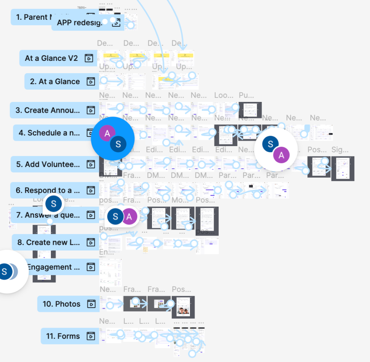
Prototype flows allowed us to gather reactions from potential users
You can learn more about Loopdee at Loopdee.com